Nat lives in Boston, MA and specializes in creating mobile, AR/VR, and 3D applications. Below are some samples of his most recent work along with his resume and dev blog.

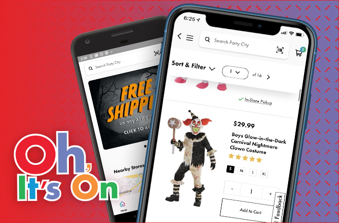
Party City Mobile App


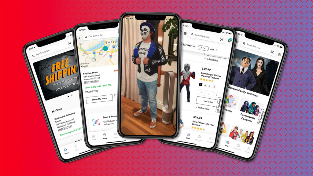
In the fall of 2019, I led the development of a new mobile app for Party City. Rebuilt from the ground up in React Native, the app shipped to both the App Store and Google Play in time for the critical Halloween shopping season.  The app allows users to search for and purchase Party City products and introduced a new pilot program for in-store mobile costume pickup, an enhanced store finder, a product scanner, and an augmented reality costume viewer. Additional features were in the works but were not launched as part of the 2019 Halloween initiative.

Update: The latest release of the live app has changed significantly and no longer reflects its original 2019/2020 design.

React-Native, ExpoKit, Redux, React-Navigation, SalesForce OCAPI, SalesForce Marketing Cloud

Party City AR

In the early fall of 2018 iOS 12 shipped with Apple’s new AR QuickLook feature. iPhone users all at once had the ability to view objects in AR natively from the Safari web browser. My colleagues at Hill had just launched a new e-commerce site for Party City.  With the Halloween shopping season approaching, I made sure our client was among the first online retailers to support this new format and while it was a relatively small initiative, it has provided us with some fascinating analytics regarding AR usage and purchasing behavior.

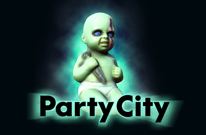
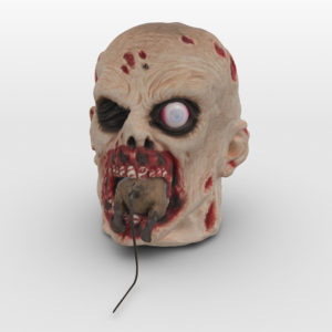
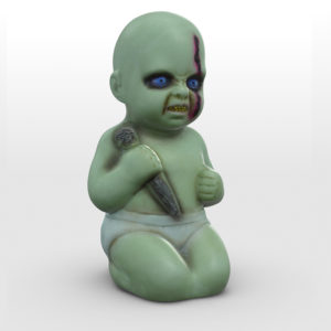
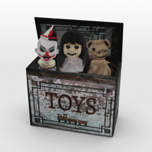
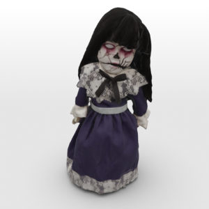
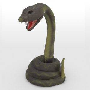
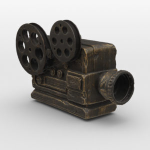
Using a 3D scanning technique called photogrammetry – a process which I’ve outlined in a recent blog post,  I created high-quality AR content for 15 products from Party Cities new line of Halloween animatronics. Below are a few examples that are view-able in Quicklook AR on iOS 12 in Safari.

Dunkin VR for POP

Hill Holliday produces over 100 unique in-store printed advertisements for Dunkin Donuts each month. These are things like register toppers, window signage, drive through extenders or those folded tent cards at each table. The industry lingo for this is POP, or point of purchase advertising. Next time you are waiting in line at Dunks just look around and admire how much print material surrounds you. A lot of money and effort is spent designing, reviewing and organizing all of this POP for various campaigns across a variety of national and regional markets to ensure that each piece of collateral is driving sales.

Our account team felt that our current review process wasn’t working effectively. Awkwardly shuffling through printouts hung up in a conference room just didn’t provide a feel for how all the POP would come together in an actual store. Sometimes issues were only revealed once everything was printed, distributed and displayed at all 65 thousand locations. As soon as a campaign could be viewed collectively in the context of an actual store, problems of illogical placement, redundant color or message repetition became apparent. But at that point, it was often too late.

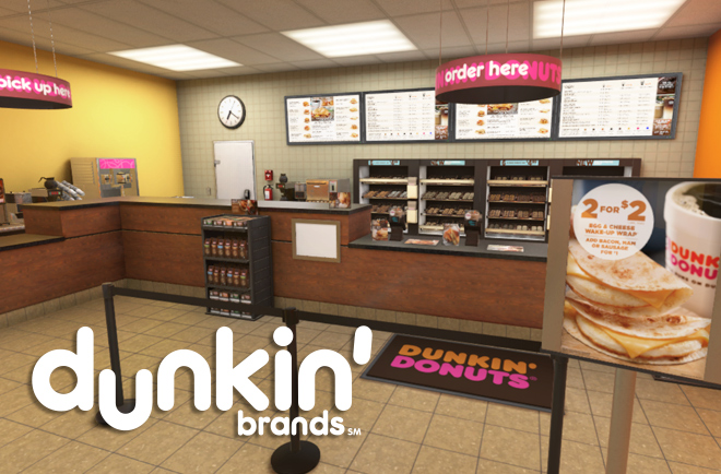
To solve this issue and to generally evolve our process of reviewing POP I was challenged to build a VR app that would allow our internal teams and our clients to review print ads within a virtual full-scale Dunkin Donuts store.

A full interior and exterior scene were modeled using a combination of pre-made and custom-built assets to accurately render a typical Dunkin franchise. I assembled all of these assets in Maya where they were optimized, UV mapped and then imported into Unity where materials, lighting, and interaction were added. A lightweight CMS was built allowing our studio teams to directly upload print assets which could be loaded into the app and swapped out in real-time by the user. An additional layer of physical interactions was also added though admittedly more for the amusement and education of the developer than anything else.

A full demo video of the project is available here.

Bounce iOS App

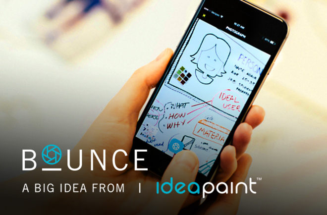
One of the clients Hill Holliday’s Project Beacon team partnered with was IdeaPaint – a local company that makes paint which can turn any wall into a dry-erase board. Our team built Bounce to solve a simple problem of what happens when the meeting is over and you want to save and continue the white-board session online.

My initial development time was spent on a prototype app to find the most efficient way for a user to capture and clean up a whiteboard photo. Using CoreImage and custom CIFilters I implemented a system to automatically detect, rectify and filter the whiteboard image from a wide range of shooting conditions. Working with our UX and design team I expanded this initial prototype to further incorporate sharing and collaboration by allowing multiple users to comment and edit on each other’s work. The beta version of Bounce was distributed via TestFlight to collect user feedback and a release version of Bounce was shipped to the App Store in the Spring of 2015. The app uses a Parse.com self hosted Parse back end and was built with Swift. I’ve been maintaining the app releasing minor bug-fixes, and updating the code base with each version of Swift since it’s initial launch.

Update: This app was sunset-ted on July 2017 and has since been removed from the app store.

Hope The Giraffe

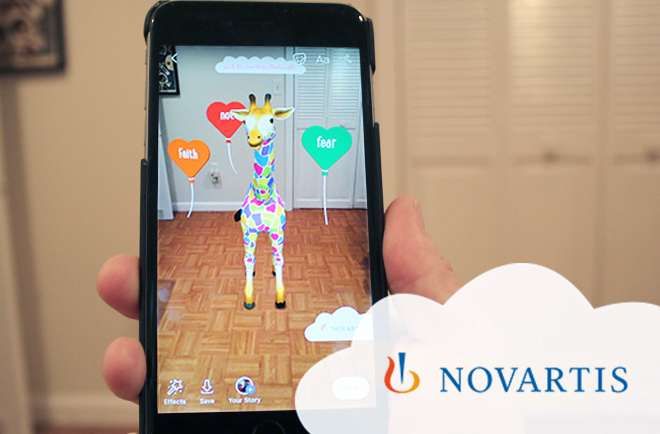
Hope the Giraffe is a character created on behalf of Novartis to help support kids (and the parents of those kids) who suffer from auto-immune diseases. For 2018, to raise awareness on her Facebook page, we created an AR camera world effect that lets kids watch Hope come to life in AR as she encourages them with her messages of support.

Hope was modified from an existing 3D asset and was rigged and animated in Maya and AR Studio.


[Redacted] Banking app

I built a native iOS & Android app for a large national banking client to test out new money management features developed by our UX team. It allows users to scan and save an organized collection of data pulled off of physical products using OCR. I am limited in how much more I can reveal about what the app does, but I can go over how it was built.

Before working on this project I programmed all of my native apps for iOS in Xcode using Swift or Objective-C. I always viewed cross-platform tools suspiciously – in part believing they were a crux for developers who didn’t want to learn new languages and with an understanding that the cross-platform trade-off often comes at the cost of performance and native feel.

However, since this app needed to support both iOS and Android and required a complex offline-first data layer, I recognized early on that this project could be a good fit for React Native. The app was built with a local Realm database yet, due to a peculiar set of requirements, still required a custom client-side syncing implementation that kept local data, often generated offline, in sync across devices through a legacy rest API. As is often the case when building an offline first application, this meant a great deal of data logic was compiled into the client app. Using React Native allowed us to leverage a single implementation of this complex code base across platforms which was a significant saver of time and sanity.

Although the app shared almost all of its code between Android and iOS, the OCR feature was integrated with iOS only through a custom native bridge written in objective-c. Other than this and a few styling inconsistencies the Android version of the app performed as flawlessly as it’s iOS counterpart.

React Native is not without rough edges. Adding yet another layer to an already complex stack introduces more dependencies and a whole new source of bugs. But the trade-off of building a single app that is performant and easy to maintain is a good one, and I expect I’ll be turning to React Native again on future projects.

Party City Web To Print App

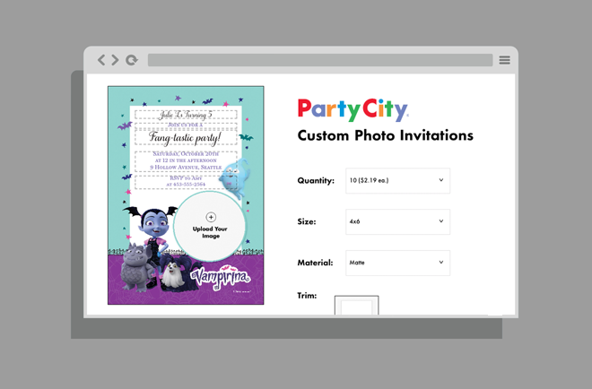
Party City had been using a 3rd party to manage its web to print production for various customized products such as invitations, banners and yard signs. In the late winter of 2019, they built out their own facility and began the process of shifting over to in-house printing in order to achieve greater profitability on these products. The job of building out a web app for customers to interface with this new system largely landed onto my lap.

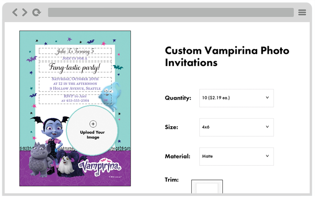
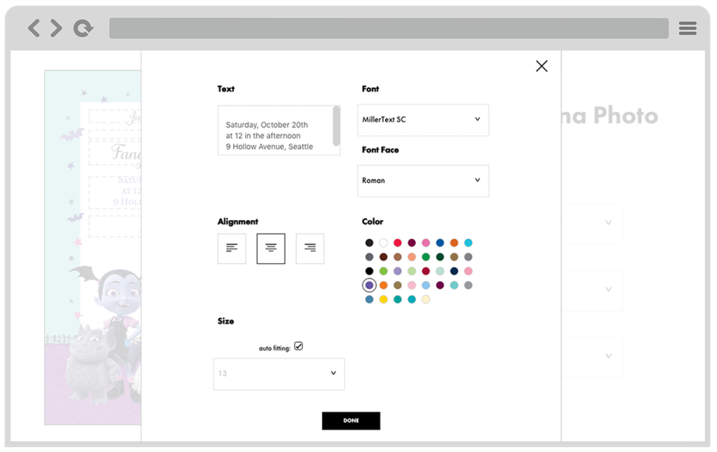
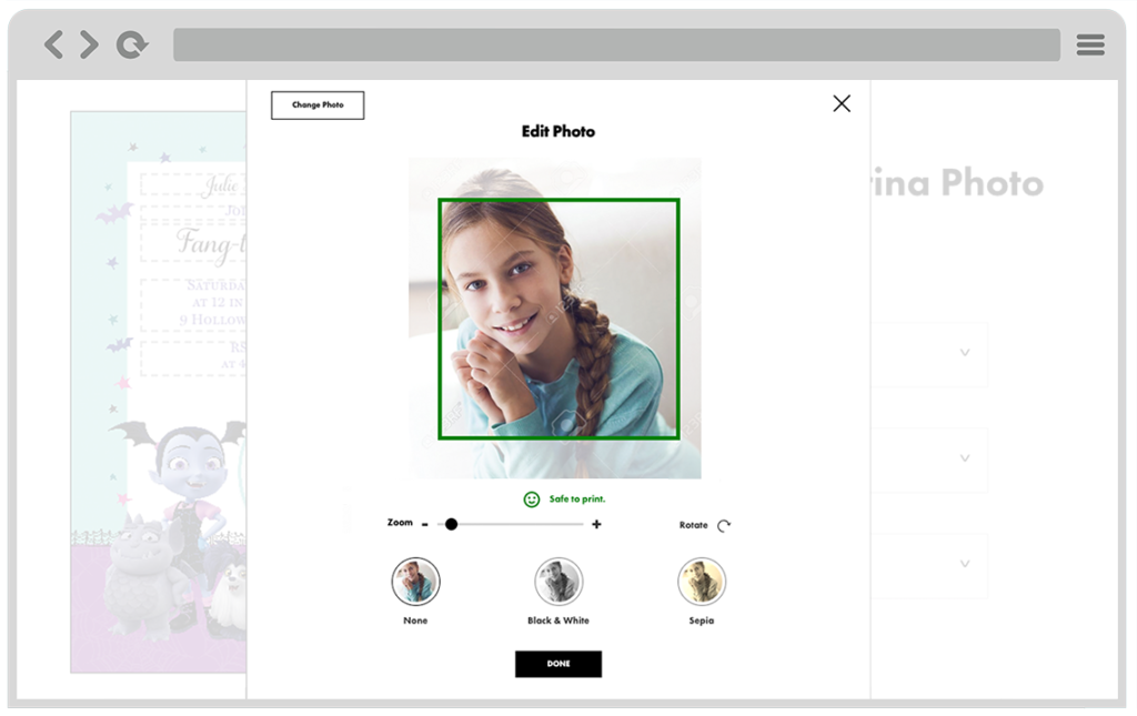
The new printers party city purchased were set up to use XMPie services which interact with documents using the XLIM format- an XML like data structure that defines the elements and layout of a document. Many thousands of these XLIM templates would be exported from InDesign and uploaded onto the XMPie server by the design teams. The web app I created was responsible for loading in these templates, allowing users to enter and edit format mapped text, manipulate and upload images, and then send everything back to the server to run proofs and final print jobs.

The app was built as a single page web app leveraging a library provided by XMPie for manipulating XLIM files called uEdit. Originally ported out of Flash, the main job of uEdit is to parse XLIM files and translate their structure accurately to HTML to be manipulated in a web browser. The library I was provided hadn’t seen an update since 2013 and came with little documentation. Learning the inner workings of XLIM required reverse engineering the single uEdit demo I could get my hands on and a lot of trial and error experimentation. It sure felt as if I was the only developer to use this product in many years. Most of its functions were designed for a very narrow point and click use case, but because our designs relied on modal dialogs, I encountered a handful of issues and shortcomings that required me to code around and sometimes directly patch the old minified uEdit source code.

I was working in parallel with multiple design teams who were pumping out new XLIM templates every day and we quickly uncovered many incompatibilities. InDesign allowed for a wide range of formating structures that were not all properly handled by uEdit. Often document properties would be applied in part to a container group and redefined on individual text boxes and so much of my dev effort was spent pre-processing the XLIM files to pull apart various nested properties and to restructure the document into a compatible format. It was a never-ending game of Wack-a-Mole, and while we attempted to set up some basic standards for the designers to follow, the burden was always on the front end code.

This was one of those projects where nothing ever seemed to work easily and we were plagued by a whole set of additional bugs when testing actual jobs run on the XMPie server. As we were resolving browser display issues, we were then finding that the proofs coming back from the printer weren’t always matching. Fonts behaved oddly, colors were reverted and text would shift or not scale properly. In some browsers, certain fonts just didn’t appear. IE gave us fits when manipulating large print resolution images. And on it went for many months with the three teams – the template designers, XMPie backend developers, and the front end team all working closely together.

Somehow, in the end, we were able to make it all work and Party City is now able to offer new customizable print products and is rapidly taking more and more of its web to print production in-house. While I pray I never have to work with uEdit or another XLIM file ever again, I do remember this project fondly for it’s challenging bugs and the opportunity to work with a talented team of developers.
Boston Public Garden iBeacon Tour

fopgAppScreens3

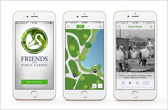
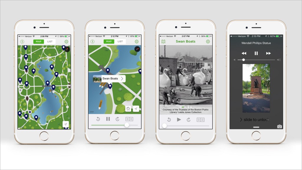
This is an iBeacon enabled walking tour app I built to help rebrand and promote one of Boston’s most visited tourist attractions- the Boston Public Garden. Working with city crews I installed and tuned 18 Gimbal Beacons in and around the public garden. The app allows users to find the public garden and then provides a non-linear audio tour highlighting the important features and monuments as they walk around.

    The tour was designed around an illustrated custom map, but thanks to the use of beacons it can be used entirely hands-free.  My goal was for the app to enhance the experience of visiting the park, but not get in the way. During development, I paid careful attention to background behavior to ensure that a user could simply lock their phone, plug in headphones and walk around with the app narrating the important sights as they are encountered.

     This app was built with Objective – C using the Gimbal SDK, MapKit, and CoreLocation. It won best mapping/location-based app in the Appy Awards and received a merit at the New England Hatch Awards

Update: We stopped maintaining this app a year or two ago and it was being managed directly by the Friends of the Public Garden. The app stopped appearing in the app store as of February 2017.

Frankly iOS App

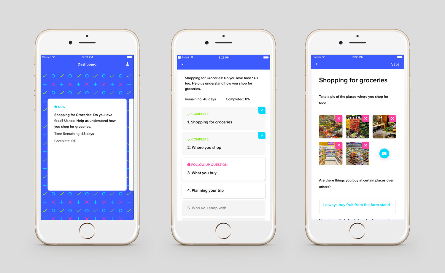
Frankly is a research app built to help the planning teams at Hill Holliday quickly spin up surveys and gain qualitative insight at scale for various client initiatives. Users can share photos, videos, written responses, and ratings, capturing their in-the-moment experiences as they interact with brands and navigate their everyday lives.

Built on top of Firebase this app but was designed be lightening fast with full offline-first support. A separate CMS was built to allow our internal teams to administrate surveys, notifications, review responses, reply to specific users with followup questions and assign cash rewards.

Swift 3.0. Firebase, PromiseKit, SnapKit.

The Raven VR

Available on Oculus Store

VRLandscape

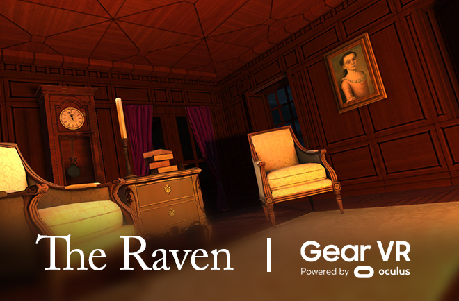
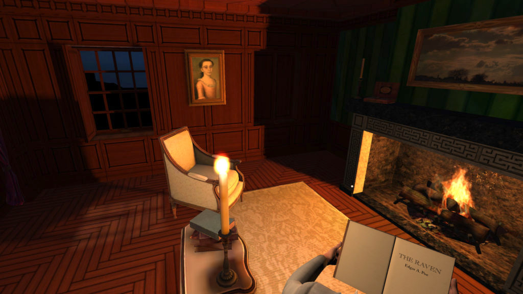
Having experimented with shooting stereoscopic 360 video a few years ago, I’ve always wanted to make something in ‘real’ VR.  And so I recently created ‘The Raven’ an interactive gearVR tribute app to Edgar Allen Poe’s most famous poem.

If you’ve played around with a GearVR you’ve likely seen the Netflix app which allows you to view a virtual wall size tv in a luxurious mountain lodge. I found that once I strapped in and was fully consumed in watching a show there was a brilliant moment when I became entirely present in the virtual space. Somehow by paying full attention to the tv show I was more easily pulled into the reality of the immediate experience. It got me thinking about why there currently isn’t a similar VR experience for the Kindle and how much fun it might be to enhance the reading experience with different genre-based environments.

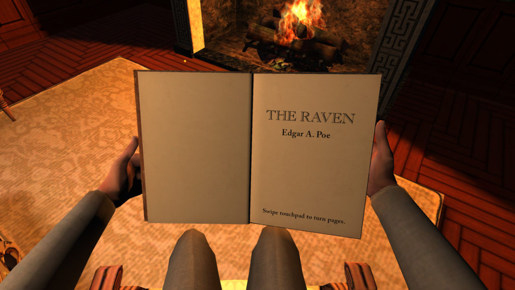
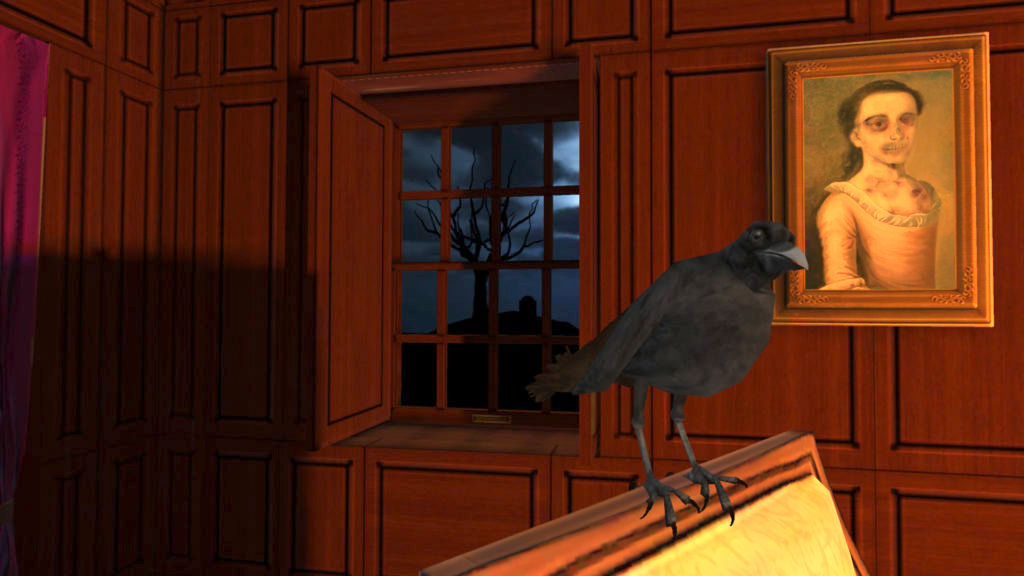
So that was my general line of thinking behind building this experience where the user is transported back to a 19th-century parlor in an armchair, next to a fire, to experience reading Edgar Allan Poe’s short poem ’The Raven’.  The fun part was that the content of the poem could then easily be brought into the experience with various props and environmental effects triggered as the reader flips through the pages.

raven5

While this app was a fairly quick kit-bashed concept demo and exploratory project for the Gear VR, it was not without its challenges. The GearVR is an extremely restrictive platform since it is running on a small mobile device with limited resources compared to desktop and console VR platforms. Achieving the target 60 FPS on the GearVR was not easy, and elements like fire (overlapping transparency) and flickering dynamic lights made it doubly so. I found that through baking all of my static meshes, applying lightmaps, and careful application of shaders and shared texture atlases I was able to come in just on budget for the required 60FPS.

is currently available as a free download on the Gear VR store in the concepts category. As of Dec 2017 it has over 41K installs.
Hill Holliday Enterprise App

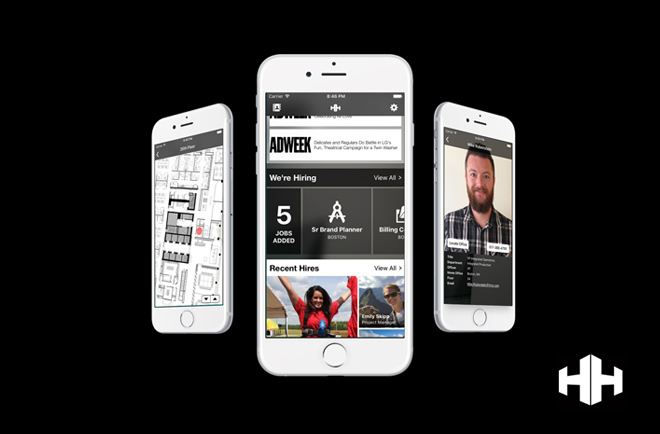
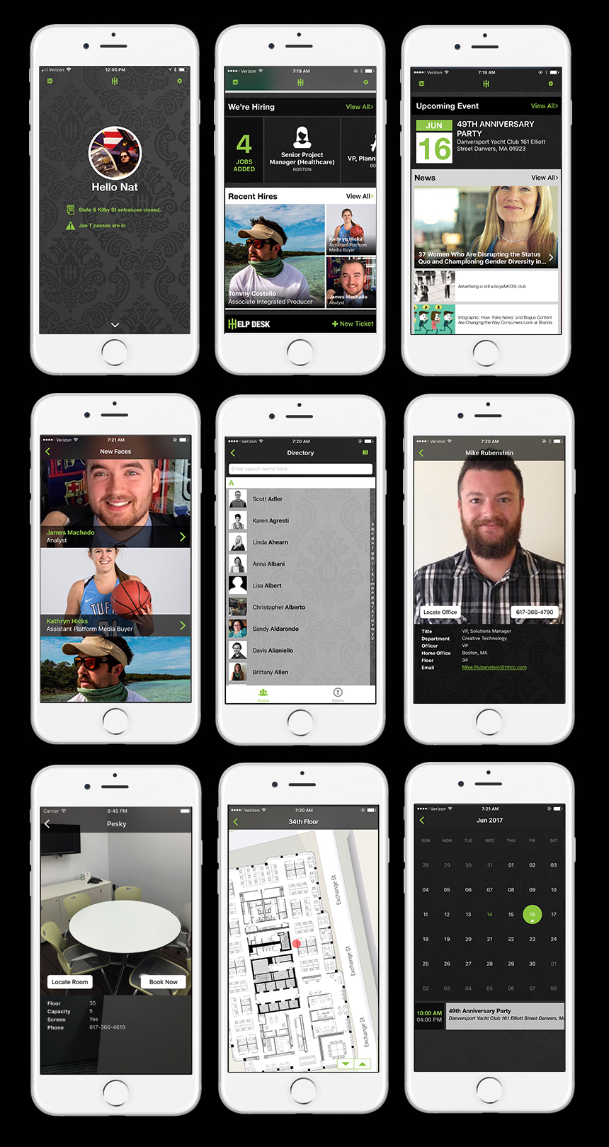
Working with research from our UX Department, I designed and built an enterprise iOS app for Hill Holliday’s 600+ employees. This app allows employees to securely log in with their company credentials, update their profile and stay informed about company news, recent hires, job postings, and important events. The most used feature, a company directory and office map, assists employees in finding one another as well as checking availability and booking of conference rooms. I’ve shipped a number of versions of this app and have been rolling in new features between other projects. We just released our latest version which uses iBeacons to detect when a user approaches the beer fridge and only allows them access if their timesheets are complete. This was my first app written in Swift and has been migrated from Swift 1.1, to 1.2 and most recently 2.0.

Liberty Mutual – Augmented Reality Book

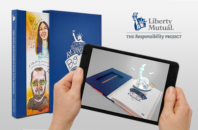
In early 2013 I built an augmented reality iOS companion app for our clients at Liberty Mutual. It was part of a market research report into responsibility but was also used to showcase in-house capabilities to our client at the same time. In addition to some 3d charts, the illustrations in the book, when viewed through the app, would come to life and speak their story in person.

I spent a great deal of effort making the effect as seamless as possible. My goal was to tightly match the animations to the physical illustration in the book so they did not look like a digital overlay but rather came alive in a very organic feeling way.

Examples of tone mapping captured from early protoype
Examples of tone mapping captured from an early prototype

This involved perfect alignment of transparent video files, but to truly sell the effect I created a tone mapping script that would read the color and lighting variations in the target image and apply those to the overlay animations.

While potentially a bit gimmicky for a research report, our client was very proud of this book and so were we. I always thought this would be a great way to present a children’s book. This app was built for iOS with Unity3d using Qualcomm’s Vuforia SDK.

Facepaint

facepaintComps

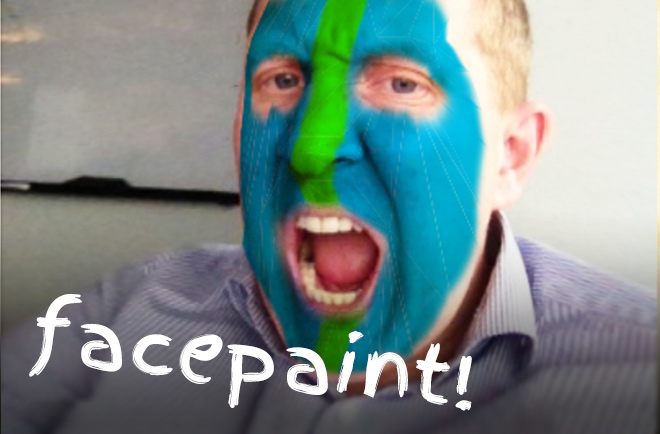
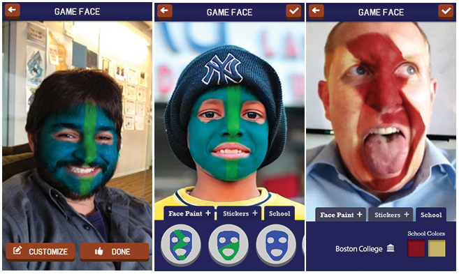
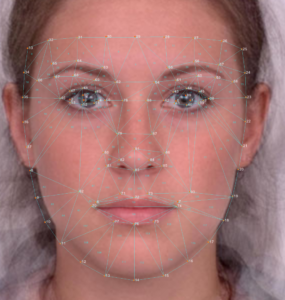
In spring of 2013, as part of a Facebook campaign to help Liberty Mutual reach college students for a discount auto insurance program, I built a canvas wrapper as part of a mobile web app to capture/upload images and automatically paint faces in school football team colors. This was well before SnapChat introduced its AR lenses and was during a time when most web browsers lacked the capability to run full face feature detection algorithms. Photos were first scanned for faces and then uploaded to a web service for more detailed feature detection that would return sets of facial control points found in each photo.

Rendering of tris generated from facial control points which were used to render masks.

Using that data like a UV set I developed a client-side canvas based system for rendering colored facepaint onto the images. Users had the ability to adjust mask control points as well as add decals and swap out colors and apply different masks in real-time. All rendering was done client side using HTML canvas and javascript.

C40 Cities WebGL Infographic

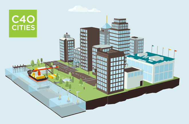
In the spring of 2012 I launched an interactive 3D web app to help C40 Cites communicate their mission of tackling climate change and driving urban action. It showcased 8 specific clean city alternatives via an animated 3D infographic displayed natively in a web browser using WebGL (at that time only an experimental feature in most browsers). My responsibilities included optimizing and exporting 3d assets in Cinema 4D and front-end WebGL programming with the three.js library.

Samsung Tweet Wrap

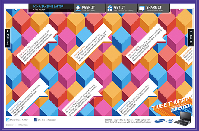
I was the tech lead and one of two front end developers (along with the amazing Greg Kepler) on this project for Samsung, which allowed users to select a pattern and have tweets of their choosing delivered to them on a sheet of wrapping paper. Since we were giving away a lot of the wrapping paper for free, security was a big challenge on this project. I worked with Giftskins, our fulfillment partner, to develop a tactic to prevent people from cheating the system and spoofing submissions for free wrapping paper. This was built on the Robotlegs framework in AS3 and received recognition on The FWA and was a nominee for One Show and Webbys

NFL Fantasy Football App


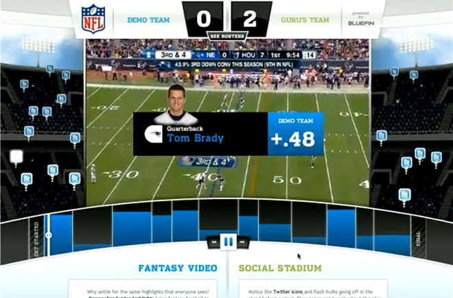
I built this app in late 2009 to help Bluefin Labs showcase their social TV analytics technology to the NFL. Bluefin’s tech was capable of analyzing live football games and dynamically breaking them down into individual plays in order to create a dataset of players, fantasy scores, and related social media. Working closely with the Bluefin team I helped develop an API and then built an interactive video player using front end playlists and bluefin’s data. This app allowed users to watch the weekly results of their fantasy football team as one continuous interactive video highlight reel. This project utilized a flash media server and was built on the PureMVC multicore framework using AS3. Roster selection by Andrew Berg.

In 2012 Bluefin labs was acquired by Twitter for 70 million dollars.

GE Terminal Command

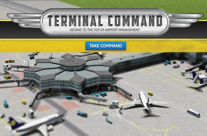
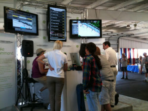
In 2011 I built a game for GE to highlight their products and services in aircraft health and traffic management. Users must manage up to three busy airports dealing with maintenance, cargo and departure tasks. The game appeared on the GE Show website and I also created a standalone kiosk version of the game for live head-to-head competition at air shows. I was tech lead on this project and responsible for game programming. It was built in AS3 with the robot legs framework.

5974750167_9918cb2257_b

5975314100_243ab7f0df_b

2012 Work Reel

The reel above represents a few of my favorite projects created primarily during my time at The Barbarian Group. A detailed list with a description of each project can be found here.